Articles
Digital Sign Board Design: 13 Tips for Creating the Perfect Display [+ Templates]
Darren Cummings
Every screen I design for, I ask what someone glances at from six feet away in two seconds. That's the real design brief for signage, not a full webpage crammed onto a TV
But effective digital sign board design isn’t just about making something look good. It requires understanding your audience, optimizing readability, and structuring information so viewers can absorb it in seconds.
The good news is that designing high-quality digital signage is easier than ever. Our own platform data shows images still make up 94% of what businesses actually display—well ahead of video or social—so getting image design right matters more than any other content type. With tools like Canva templates and digital signage software like Juuno, you can design and launch professional digital signboards in minutes.
Whether you’re creating signage for retail promotions, corporate communication, menus, or announcements, understanding the principles of effective digital sign board design is essential.
The basics of digital sign board design?
Digital sign board design refers to the process of creating visual content optimized for digital displays such as TVs, monitors, and digital signage screens.
Unlike traditional print signage, digital sign boards must consider factors like:
Viewing distance
Screen resolution
Dwell time of viewers
Motion and animations
Content rotation and playlists
Effective digital signage design combines visual design, marketing strategy, and audience psychology to communicate a message in just a few seconds.
When done correctly, digital sign boards can increase customer engagement, improve in-store promotions, enhance workplace communication, reinforce brand identity, and drive more conversions and sales.
Plus, digital signage offers a more sustainable alternative to continuously printing and displaying posters.
13 design tips I'd share with any client
Follow these tips to help you create an effective digital sign.
1. Create goals for your content
Before choosing colors, fonts, or layouts, define the goal of your digital sign board design.
Ask yourself:
What action should viewers take?
Is the goal to inform, promote, or entertain?
Who is the target audience?
Creating clear objectives helps guide every design decision and ensures your signage delivers the intended message.
Digital signage works best when each design communicates a single clear message.
2. Consider the audience you are designing for
Your target audience matters when it comes to design. This could be both demographics and groups. For example, designing a sign to engage baby boomers will most likely be glossed over for someone in their twenties.
Another example is employees versus clients. The digital sign you design to inform employees needs to be distinctly different than what you display for your clients. Do your research to understand your target audience so you can design content that improves customer engagement.
3. Know the intended dwell time for your digital sign
Dwell time is another major consideration in how and what you display in your digital signage. Dwell time can be broadly classified into three categories:
Short-duration (< 30 seconds) - digital signage used where people are on the move. Such as shop windows or airport terminals.
Moderate-duration (30 seconds - 2 minutes) - dwell time associated with people waiting in lines or queues.
Long-duration (> 2 minutes) - locations where people will spend a dedicated chunk of time like waiting areas and restaurants.
The longer the anticipated dwell time the more content you will want. This could be the amount of information on a single sign or the number of digital signs in a playlist. The choice will depend on your objectives so make sure you're aware of your dwell time when designing.
4. Monitor the file size
Throughout the process of designing your digital signage keep in mind the size of your image files. If the files are too large, then you can run into trouble displaying them through browser-based digital signage if the WiFi is not at peak performance.
In general, file sizes in the 2-3MB range tend to be ideal for digital signage.
Note that if you find your file sizes becoming excessively large and you are following the other tips in the guide, check for hidden images and unused formatting.
5. Know your display ratio
Unlike a website, a digital sign is not meant to be displayed on a variety of devices. You will be designing your displays for your digital signs and TV screens. So know your display ratio.
If you are using standard digital TV screens, the width-to-height ratio is 16:9 in the landscape orientation and 9:16 for portrait. Luckily, most digital signage content creators and template providers like Canva are fully aware of these ratios. But it is always important to know your ratio to make the best designs.

The image above shows three display screen ratios and highlights the need to know your ratio to get the most out of your designs.
According to our platform data, 92% of screens on our platform run landscape and just 8% run portrait. Design for a wide format first unless you have a specific reason, like a narrow hallway or a tall menu list, to go portrait.
6. Design for HD resolution
High Definition (HD) describes the display resolution of digital images and refers to the clarity of the display. In terms of pixels, the resolution of full HD televisions is 1920x1080 pixels in landscape orientation.
When designing your digital signage displays, make sure you are getting the full display potential of your screens. Do this by ensuring the images and videos you share meet the 1920x1080 HD pixel criteria.
Also, be aware that the higher resolution means larger file sizes.
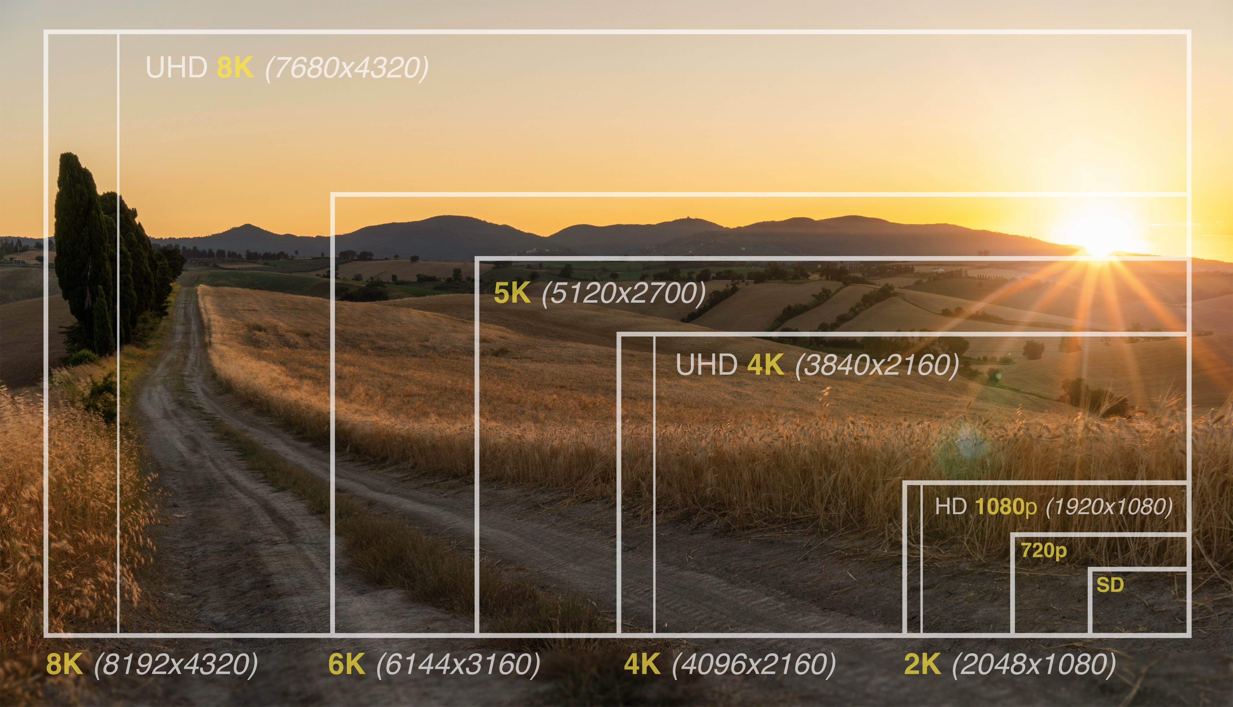
This image highlights the comparison of resolution size.
7. Select contrasting colors
Selecting contrasting color palettes is a must. Contrasting colors grab people's attention and make your text readable. Whether it's light on dark, dark on light, or one of the endless contrasting color combinations, you want your sign to be read. So, make it as easy as possible for people to read it.
Effective combinations include:
White text on dark backgrounds
Dark text on light backgrounds
Complementary color pairs
8. Choose simple fonts
Font selection is important for readability. It is often an area that is overthought. We see fancy, embellished fonts and fall in love. Unfortunately, ornate fonts can be impossible to read.
Avoid overly decorative fonts that make text difficult to read from a distance.
Instead, prioritize clean sans-serif fonts such as:
Helvetica
Open Sans
Roboto
Arial
These fonts remain legible even when viewers are several feet away from the screen.
9. Test your text sizing
Remember when designing your digital signage that the person reading your sign is not sitting at the computer. Typically they will be around 10 feet away. Make sure your text size reflects the distance at which your sign will be read.
For a reading distance of 10 feet, the minimum recommended text size is 82pt. If you know the target viewing distance then you can determine the minimum text size. Keep in mind that color choices and font types can change these values so be sure to test it out.
10. Use high-quality images and graphics
Digital signage reflects your brand. Poor-quality visuals can damage credibility.
Invest in high-resolution images, graphics, and videos to create a polished and professional appearance.
High-quality visuals help build trust and perceived brand quality.
11. Use widgets and integrations
Static text and images are a good start to your digital signage boards. But to really make your boards stand out and engaging you will want to add widgets and integrations.
Widgets like weather and news can provide useful information to your viewers. Integrations like Instagram, Facebook, and X (Twitter) can integrate your company’s freshest content into your signage.
12. Plan your content layout
With your objectives in place and tools in hand, it is time to consider the layout of your content. A good layout will balance the composition of the design and direct the attention of the viewer. While there is no single solution some layout methodologies to consider are:
Rule of thirds - for this classic composition you divide your layout into thirds vertically and horizontally. You then place the primary elements of your design at the intersections.
Follow natural eye movement patterns - there are two common patterns our eyes naturally follow when presented with a fresh page. A “Z pattern” when there is a low level of text, and an “F pattern” when there is a lot of text.
Maintain an edge buffer - crowding edges run the risk of content clipping when it is projected on the screen. Make sure you keep a buffer around the edge of the digital sign.
Use the 3x5 text rule - this advertising guideline will help you decide the amount of text to include. Either three lines of text with a maximum of five words in each line, or the reverse.
Content hierarchy is key - not all the information you present will have the same importance. Consider the hierarchy of your content in its placement within the design.

In this example from Canva several of the layout criteria are observed. First, the text follows the “F pattern” with content hierarchy. The company name and 30% off hamburger image being the first two items to catch your attention. Next are the three menu categories directing you to the column of interest. The rule of thirds is also observed as well as an edge buffer.
13. Rely on design templates
With resources like Canva available, there are tens of thousands of templates for just about everything. There is no reason to reinvent the wheel. Starting with a template will save you tons of time.
When selecting a template, keep in mind the design tips we discussed. Also, search for one that is as close to your brand as possible. This will minimize your workload while ensuring your signage is engaging and easy to read.
If you're looking for more advanced content creation tips, check out our guide to AI digital signage.
From our platform research, 15% of businesses already display Canva designs directly on-screen. Templates aren't a shortcut people are embarrassed to use, they're what most well-run accounts are actually doing.
5 digital signage design templates worth using
Juuno integrates with Canva. Allowing the creation of captivating digital signage for all types of content in a matter of minutes.
Here are a few examples to get the creative juice flowing.
1. Digital signage announcements template

In this easy-to-read job vacancy template, we see a clear example of simple contrasting text with a large font size focused on the key information. The hierarchy of information is clearly identified by text size and placement. The simple speech box overlay emphasizes the communication nature of the sign and will draw in the intended audience to read more.
2. Digital signage real estate listing
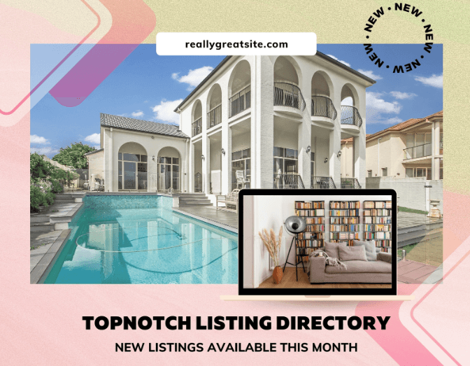
This simple real estate listing template utilizes the Z pattern of natural eye motion. The transparent image overlays in the adjacent corners further enhance the Z pattern. The company website and new listing clearly stand out without taking away from the focal point that is the house.
3. Digital signage menu template

The above menu template has a unique play on design while being compelling to the eyes. The title and images pull the eye into the Z pattern even though the menu is text-heavy. This really directs the audience to the key items displayed in the images. And with the simple contrasting text of the menu items the sign is easy to read.
4. Digital signage gym class template

Promoting new classes at a gym is a great use of digital signage. This gym class template uses hierarchy and image overlays to carry you through the sign. The large title text is easy to read, and the contrasting colors of the CTA bring the sign together. Also note that the focal point of the bodybuilder and the title text fall within the rule of thirds placement.
5. Digital signage promotion template

This promotion template is elegantly simple. It uses the 3x5 text rule as the CTA and branding with the three overlapped images. This digital sign would be a great promotional piece at grocery stores. This style would also be a great choice for health spas and clinics that wanted to highlight specials or add-ons to enhance the spa experience.
Start creating digital sign boards in minutes
Designing effective digital signage doesn't require a design team, and for small businesses that want to launch fast, Juuno is the best digital signage software to design and publish sign boards without hiring anyone.
Now that you're ready to design, don’t forget to choose the right content manager for displaying your designs. And if you're new to the game, here's a breakdown of what you’ll need to get your digital signage up and running.
Frequently asked questions about designing digital sign boards
1. What makes a good digital sign board design?
A good digital sign board design is clear, simple, and easy to read from a distance. It focuses on one main message, uses high-contrast colors, readable fonts, and strong visuals. Effective designs also consider viewer dwell time and screen resolution to ensure the message is understood within just a few seconds.
2. What size should text be on a digital sign board?
Text size depends on the viewing distance, but generally digital signage should use large fonts to ensure readability. For viewers around 10 feet away, a minimum text size of about 80–82 points is recommended. Headlines should be even larger to capture attention quickly and communicate key information immediately.
3. What resolution should digital signage be designed for?
Most digital signage screens use Full HD resolution, which is 1920 × 1080 pixels. Designing at this resolution ensures that images, graphics, and text appear sharp and professional on standard displays. Higher resolutions are possible, but designers should balance image quality with file size and system performance.
4. How much text should a digital sign board include?
Digital sign boards should use minimal text because viewers often only glance at screens for a few seconds. A common guideline is the 3×5 rule: three lines of text with five words each. Keeping messaging concise ensures the viewer can quickly understand the content without feeling overwhelmed.
5. What colors work best for digital signage?
High-contrast color combinations work best for digital signage because they improve readability and grab attention. Examples include white text on dark backgrounds or dark text on light backgrounds. Colors should also align with brand guidelines to maintain consistency while still making the message easy to read.
6. Why is digital signage design important for businesses?
Digital signage design directly affects how well your message is communicated to viewers. Well-designed displays capture attention, reinforce brand identity, and encourage engagement. Businesses use digital sign boards to promote products, share announcements, and improve communication with customers, employees, and visitors.
Start displaying your digital signage in a matter of minutes with Juuno.